Kindfy - App
Case Study
Kindfy — Volunteering and social impact platform (Mobile App).
01. The Challenge
Kindfy connects people and organizations for volunteering activities. The challenge was to design a platform that reduced signup friction and increased volunteer trust, transforming the intention to help into concrete action.
Methodology
02. Discovery & Ideation
Research & DefinitionAudience & Personas
We focused on young adults (18–35) looking to positively impact their community but facing barriers like lack of time or information.
"Multitasking university student. Wants quick, one-off opportunities that fit her weekly schedule."
"Connected professional. Looks for local causes and needs transparent communication from the NGO."
Key Insights
- Descriptive microcopy increases immediate understanding.
- Step-by-step signup reduces abandonment by 25%.
- Seeing the map and tasks before signing up builds trust.
Benchmarks
We analyzed players like Atados, Worldpackers, and HelpStay.
Kindfy Differentiators- Simplified signup (social login)
- Smart filtering by geolocation
- Integrated post-signup schedule
Structuring Solutions
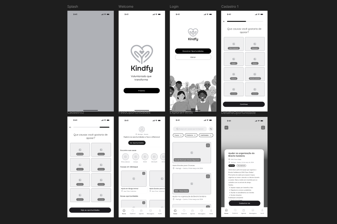
In low-fidelity wireframes, we validated the main navigation flow without visual distractions.
- • Focus on information hierarchy
- • Signup flow testing
- • Definition of key components
03. Final Result
UI Design & Delivery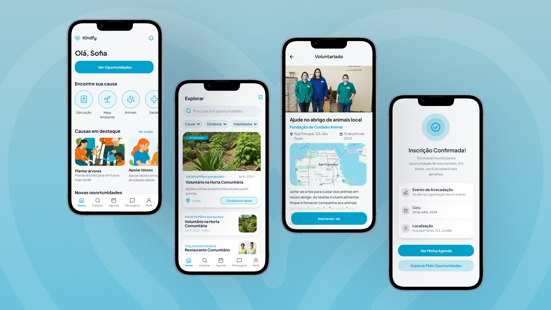
High Fidelity
The final UI brings vibrant yet welcoming colors, readable typography, and easy-interaction components.
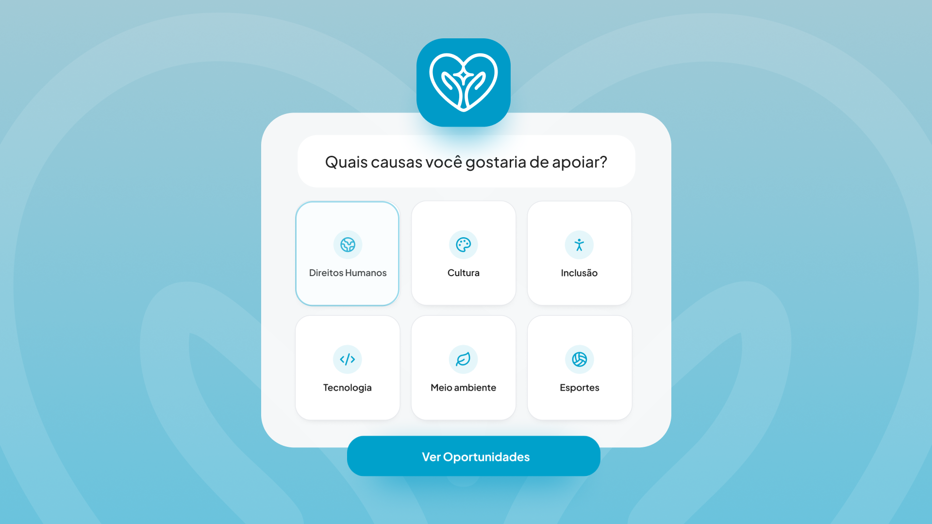
Highlights: Cause cards with custom iconography, strategic use of white space, and consistent CTAs.
See prototype in Figma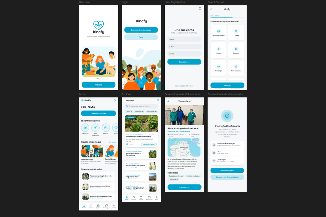
Accessibility & Inclusion
Ensured AAA contrast ratios for small text and AA for graphical components.
All buttons and interactive links have a minimum touch area of 44x44px.
Logical header structure and ARIA labels for screen readers.
Next steps: Moderate testing with 5 real users, iteration on filter microcopy, and pilot with 2 partner NGOs.