Unavanti – Site Redesign
Case Study
Unavanti — Corporate redesign focused on trust and conversion.
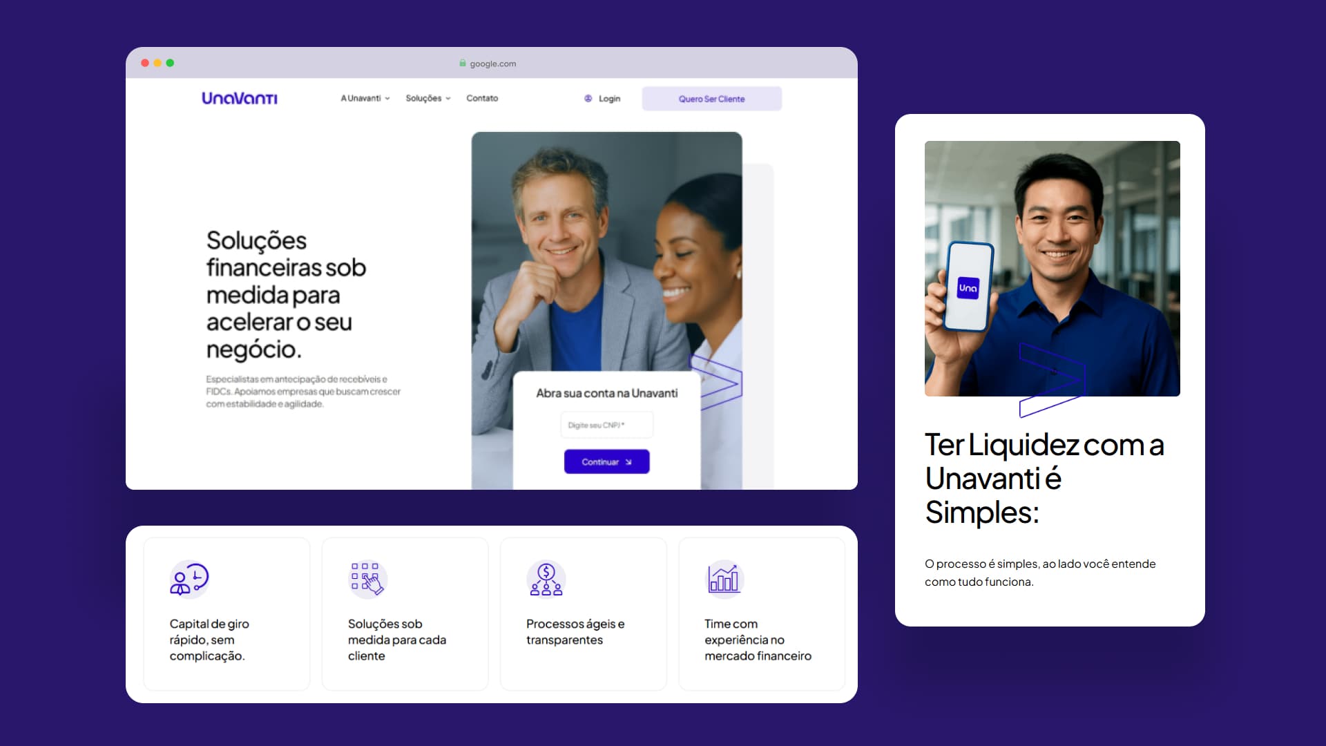
Unavanti – Site Redesign Overview
01. Context
Unavanti is a financial sector company that needed to modernize its corporate website. The redesign focused on conveying more trust, communication clarity, and generating qualified leads.
The Problem
- Outdated and unclear website.
- Main CTA (“Open your account”) not functional.
- Confusing structure, no visual hierarchy.
- Low visitor-to-lead conversion rate.
Original Site (Before)

02. Diagnosis
Heuristic EvaluationI conducted a heuristic evaluation on the old site. The diagnosis revealed navigation problems, visual inconsistencies, and form validation failures.
Key Findings
-
Weak Visual Hierarchy: Lack of clarity on what was most important.
-
Confusing Navigation: The menu did not indicate the active section.
-
Fragile Forms: Superficial validation allowed proceeding with errors.
Redesign Goals
Highlight Products
Improve Navigation
Persuasive Comms
Increase Leads
03. Transformation
Before & AfterServices Page
Before
After (Solution)

Forms & Conversion
Before

After (Solution)

Design Process
01
Understanding the User (Persona: Carlos)
Consultancy partner seeking safety and agility, but abandons registration due to lack of clarity.
02
Mapping & Wireframes
Defining structure before visuals.
03
High Fidelity Prototype
Visual refinement focused on conversion.
Structural Wireframes

Conclusion
"Unavanti's site gave me more security and clarity. Now I can find information quickly and reliably."
Clarity & Trust
Visual Consistency
Higher Conversion